I’ve written a couple of posts now on Excel Power Maps (Power Maps for Excel, Formatting Data for Power Maps), which is a great tool for creating maps from Excel data. Similar maps can also be created using Excel Power View.
You’ll probably need to enable Power View to be able to use it. There are good directions at this link. I would also recommend installing Power Query, which is the add-in that collects the data.
Get Data for Power Query Maps
First, you’ll need to create or find some data that contains location information. For this exercise, I exported my calendar from Outlook. (In Outlook 2013, click File, then Open & Export. Click Import/Export, then export to a comma separated values file.) You can also find data on Wikipedia and import it with the From Web button under the Power Query tab.
 I cleaned up the date a little by deleting records that didn’t have addresses and fixing some spelling errors. Power View prefers the location information in one field, instead of broken up by address, city, state, and zip code.
When the data was ready, I launched Power View, by clicking the Power View button under the Insert tab.
Using Power View
After clicking the Power View button, Microsoft will create a new tab and insert what looks like a Pivot table. Power View offers a variety of charts, graphs, and other ways to view data. Maps are just one of those options.
 In the Power View Fields section on the right, choose the fields you want to use in your map. In this case, I chose, subject, end date, and location.
 Creating a Map in Power View
 To turn this chart into a map, click the Map button under the Design tab. Several maps will likely appear in a matrix, one for each location. I wanted one big map that houses all of the locations, so I needed to change the way Excel is interpreting the data.
In the right hand column titled Power View fields, you’ll notice the fields have been assigned to certain categories, including Title By, Size, Locations, Longitude, and Latitude, Color, Vertical Multipliers, and Horizontal Multipliers.
In my chart, Subject and End Date are listed as Vertical Multipliers, and that is causing Excel to create a new map for each new point. I reorganized the data, by dragging Location to the Locations category, End date to the Color category, and Subject to the size category. Subject became Count of Subject, meaning that the more often I visited a location the bigger the circle on the map.
The map is interactive, in that if I click on the End Dates in the right hand column, I can limit the view to only specific dates.

Creating a second chart
One of the advantages of Power View is that you can create several charts on the same dashboard, and these charts are linked to each other.
 Select your Power View Map and hit Control + C. Then hit Contol + V to paste the map. A second map will appear atop the first. Position the two maps, so they are both visible.
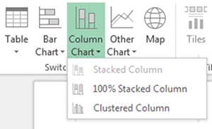
Select the second map, and choose Column Chart in the Switch Visualization group of the Design tab. Choose stacked column, and the second map will choose into a bar chart.
Again, Excel needs some help understanding the data. I dragged Subject to the Values category and End Date to the Axis category. I removed the location field from this chart, by unchecking that box.

Interacting with the charts
The charts are connected to each other. You can click on one of the bars or one of the locations on the map and the opposing chart will update to highlight that information. This is hard to see as a screen shot, but trust me, it’s cool.

Hi nice reading your bblog