Microsoft Power Map for Excel 2013 extends the software’s tool set to include seeing data on maps.
Download the Power Map for Microsoft Excel
To get started with Power Map, you’ll need to download the software from Microsoft. If your Excel software comes from an Office 365 subscription, this will happen automatically, but otherwise, follow this link to download the “Preview” version. http://www.microsoft.com/en-us/download/details.aspx?id=38395
You may also want to install Power Query (http://www.microsoft.com/en-us/download/details.aspx?id=39379), which is a tool that makes getting data much easier.
Once that software is installed, you’re ready to go. You’ll notice the Power Query tab is now visible in the ribbon.
Find data for Power Map
Microsoft Power Map doesn’t require Latitudes and longitudes. Regular address information is fine. The software works with Points on a map, but doesn’t have a way to express lines or polygons.
 Your company likely already has geographic data, but for this example, we’ll grab our data off Wikipedia. I found this list of wealthy counties (http://en.wikipedia.org/wiki/List_of_highest-income_counties_in_the_United_States) and copied the URL.
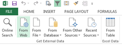
Click on Power Query tab and choose From Web in the Get External Data group. Enter the URL and clicked OK.
The software will now attempt to find usable data, and in the case of this page several tables come up. I found the table I wanted and clicked load. Microsoft brought in the data, and now I’m ready to map it.

Mapping the data
 Select any cell in the data table, and then under the Insert tab, choose Map. This will launch the Power Map program.
When you first start Microsoft Power Map for Excel, you’ll notice a wizard on the right. In that wizard, start by selecting and assigning the columns for the geolocation. The program does a good job of finding address information, but if your data is complex, you might need to help it along. When you’re ready, click next.
The next option will be to choose the fields that will determine. These vary based on the type of map you’re creating. For a bar map, you’ll have height, category, and time.
- Height – The height determines the height of the bars on the map.
- Category – The category will change the colors of the bars. For example, if your data were to list different categories of products, then choosing the categories would change the color of the bars.
- Time – See how data changes over time by selecting date data.
For my data, I think a heat map works best, so I’m only offered Value and Time.
There are a lot of tools here, and I’ll be working through them in future blog posts. Here are a couple shots of the map.


[…] ← Power Maps for Microsoft Excel November 11, 2014 · 7:26 am ↓ Jump to Comments […]
[…] written a couple of posts now on Excel Power Maps (Power Maps for Excel, Formatting Data for Power Maps), which is a great tool for creating maps from Excel data. […]