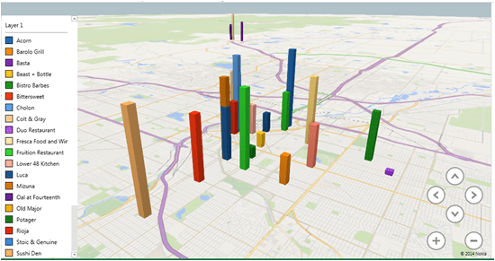
5280 Releases their iconic list every year of the best restaurants in Colorado. I thought it would be fun to bring that into Excel Power Maps to visualize the data.
You can find the complete list at this link. The data isn’t in a table, so I had to manually type up the address of each location.
You’ll notice most of the information is pretty straight forward. I did add two columns to improve the way the visualization works.
The first column you’ll notice in inverse rank. I wanted the height of each column to match the restaurant’s rank, meaning that better ranked restaurants would have taller bars. Excel sees the rank as a simple number, so a number 1 restaurant is smaller than a number 25. I simply inverted the ranking to make the bars the right height.
The second column I added was Rank Time. I wanted the restaurants add one by one, like on a timeline, so I assigned the 25th restaurant January 1st, the 24th restaurant January 2nd, and so on. I can then use this column to control the time.
I think it’s interesting that the restaurants cluster so tightly. No restaurants in Vail or Durango made the cut? Also, the Denver metro area is 200 Square miles. Why are so many great restaurants within a few blocks of each other?
To better show phenomenon, I created a heat map with the data.
Power Map Preview is a free add in by Microsoft for Microsoft Excel. You can download a copy at this link. http://www.microsoft.com/en-us/download/details.aspx?id=38395
